

On this page you will learn how nPro prepares the results of a project for you: from the summary through the complete economic feasibility calculation with key figures, the net present value curve and the cost breakdown to the detailed energy evaluation – and how several variants can be compared directly.
Overview of the results section
Once the operational simulation in the energy center is complete, the extensive results can be called up quickly in nPro. They are divided into three areas:
- Summary and variants: the most important key values of the project at a glance, separated into overall system, energy center and economic feasibility
- Economic feasibility: the complete economic feasibility calculation with key figures, net present value curve and cost breakdown
- Details: the detailed energy evaluation with annual totals, maximum capacities, shares and monthly profiles
The calculation is carried out using the net present value and annuity method based on VDI 2067 – including residual values and replacement investments for plants whose service life does not match the period under consideration.
Summary and variants
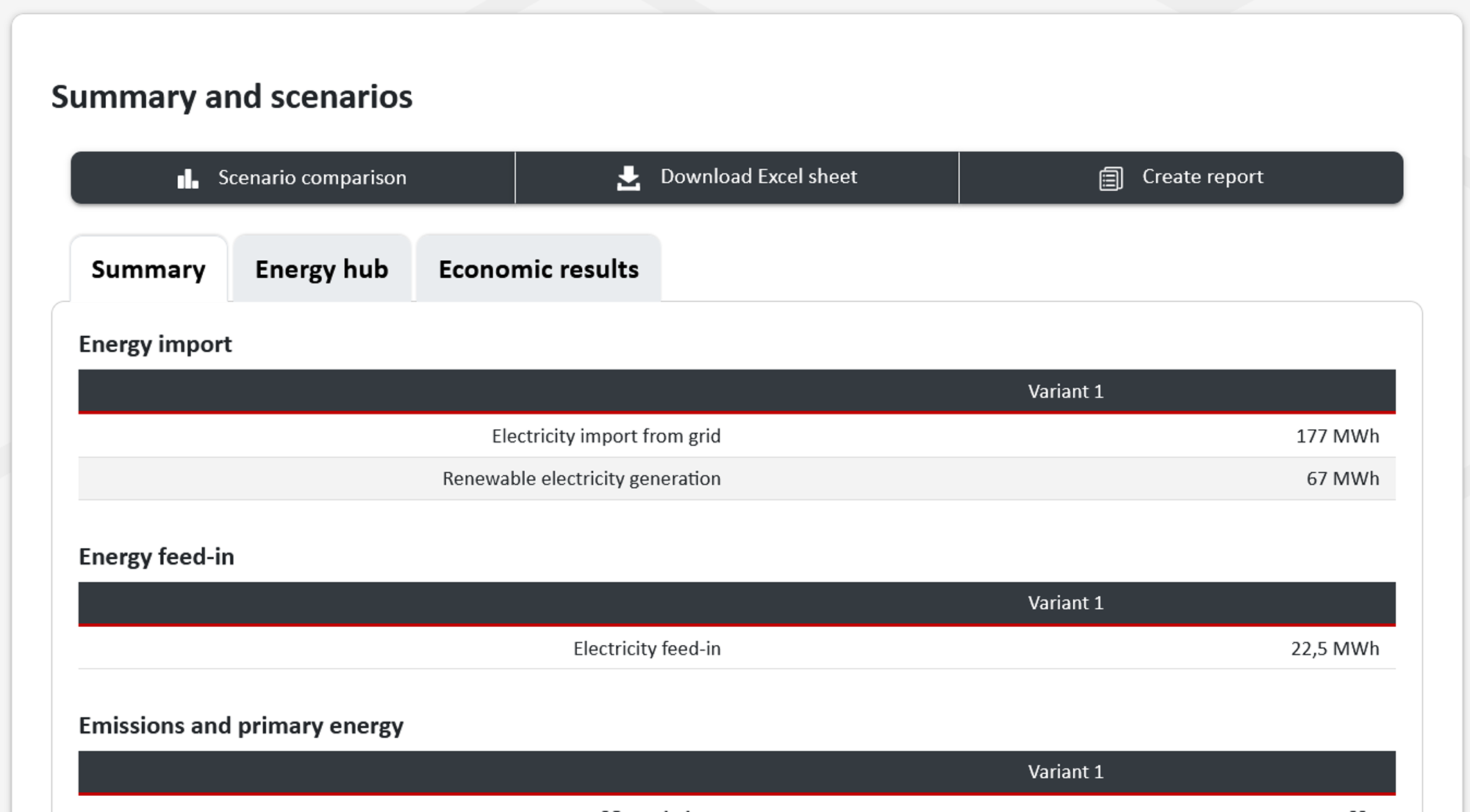
This section summarizes the project in three tabs (see Figure 1).
The summary shows the energy and environmental balance of the overall system: the energy purchase separated by sources, the feed-in, the CO₂ emissions and the primary energy – in each case in absolute terms and specifically per kilowatt-hour of heating or energy demand – as well as the system COP. Furthermore, information on the building or district can be found here. Below this, the underlying project data such as location, discount rate and time horizon considered are also listed, so that the boundary conditions of the calculation are reported directly alongside the results.
The energy center tab breaks down the results by technology. For each generator, the energy generated, the electricity demand, the full-load hours and the nominal capacity appear; for storage units, additionally the storage capacity, the energy charged and discharged, the storage volume and the number of full charging cycles. This makes it possible to check immediately whether a plant has a plausible utilization or whether a storage unit has been oversized.
The economic feasibility tab shows the economic key figures together with a cost breakdown structured by investment, maintenance and energy costs as well as revenues – broken down to the individual plant.
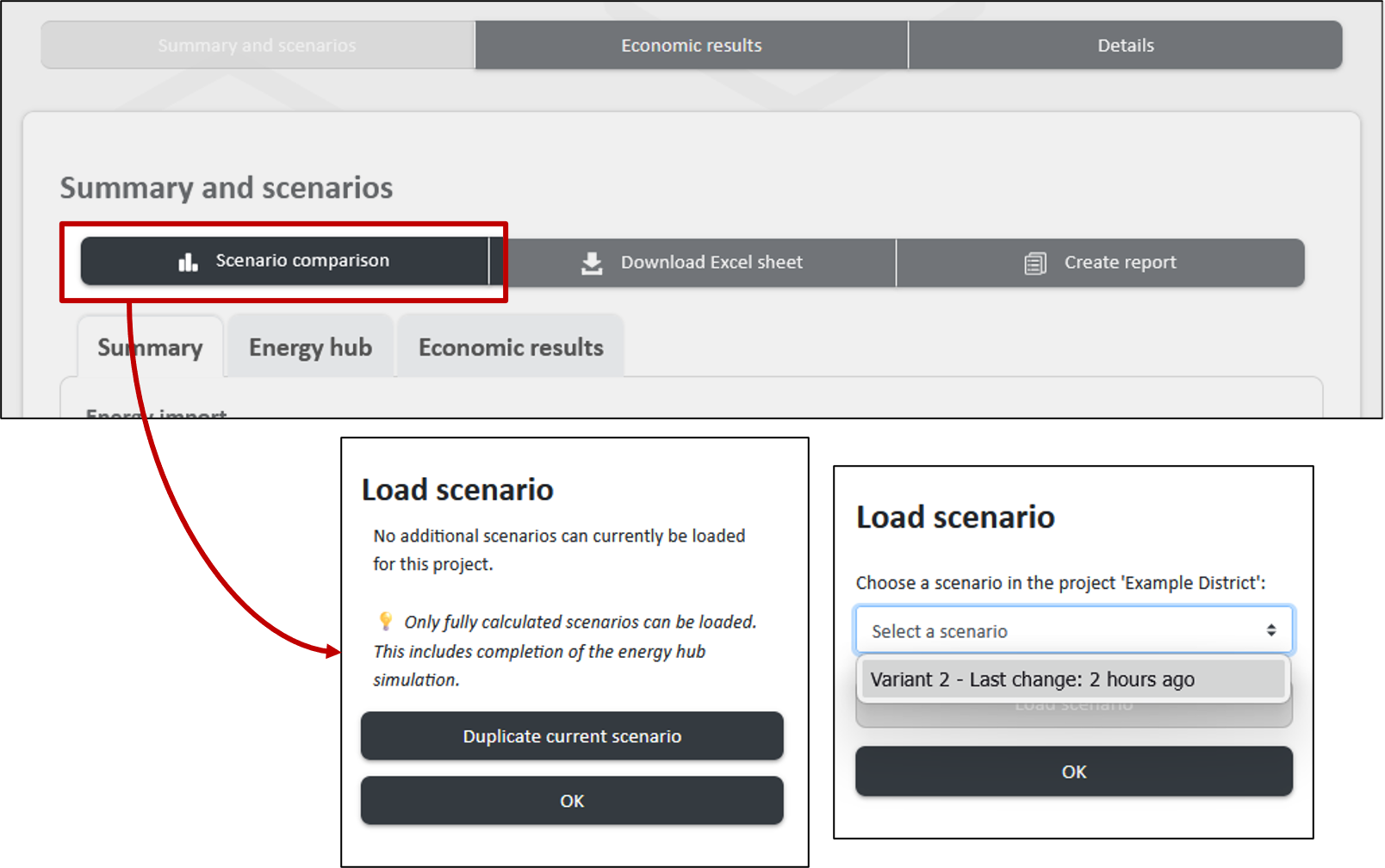
Above the tab area there are three functions for further processing: the variant comparison, which places several variants of the same project side by side, the Excel export of the results as well as the report generation, which transfers the results into a reusable document for detailed documentation.
Economic key figures
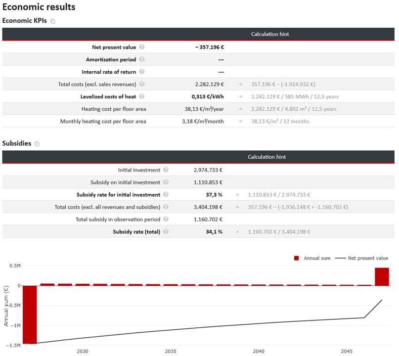
The economic feasibility area begins with the summarizing key figures (see Figure 2):
- Net present value: the sum of all cash flows discounted to the start of the project. A positive value means economic viability under the chosen assumptions.
- Payback period: the point in time at which the cumulative, discounted cash flow first becomes positive – i.e. a dynamic payback that includes the interest effect.
- Internal rate of return: the discount rate at which the net present value becomes exactly zero. It can be compared directly with the return expected from the project.
- Total costs (excl. sales revenues): the present value of all costs without the revenue side – the value required to determine the levelized costs.
- Levelized cost of heat and levelized cost of energy: total costs in relation to the amount of energy delivered, in €/kWh. If a district or single building is considered, the (monthly) heating or energy costs per floor area are also reported.
In addition, where relevant for the project, detailed information on the subsidy is listed, including the subsidy on the initial investments as well as the corresponding subsidy rate.
Every key figure carries a calculation note that discloses the underlying calculation. In this way, every reported figure is traceable instead of merely standing there as a result – an essential point when the results have to be justified to clients or funding bodies.
The key figures are supplemented by a diagram showing the annual total of all cash flows as bars and the net present value as a line over the period under consideration. The zero crossing of the line is the payback, and its height at the right-hand edge is the net present value at the end of the project duration.
Parameters, subsidies and revenues
Below the diagram, six buttons lead to the levers of the economic feasibility calculation. The first row concerns the project-wide framework conditions, the second the cost parameters of the three system parts.
- General parameters: discount rate, time horizon considered and its start year, annual price changes including the inflation rate, CO₂ pricing as well as the operating cost subsidy according to BEW for heat pumps and solar thermal systems.
- Other costs: freely nameable items that cannot be represented anywhere else. One-off costs are entered with amount, service life, maintenance costs and subsidy rate – for example the energy center building, the network pump, pressure maintenance and valves or the planning costs. Annual costs such as administration or insurance are entered with amount and subsidy rate.
- Revenues: the price model for covering the useful energy demands. Energy price (€/kWh), capacity price (€/kW) and base price (€/year) can be activated individually, in each case separately by type of demand – depending on the project, for example heating and cooling demand, user electricity, electric mobility and hydrogen. In addition, there is a one-off connection fee per building, which reduces the initial investment. Here, too, an annual price change can be entered. This makes it possible to reproduce real price sheets instead of reducing the revenue to a single energy price.
- Building energy systems: investment costs, service life, maintenance costs as a percentage of the investment as well as the subsidy rate – for every technology installed in the buildings, for example domestic hot water storage tanks or heat transfer stations. The investment costs are stored as size-dependent values, so that the costs per unit decrease as the plant size increases.
- Heating network: service life, maintenance costs and subsidy rate of the network investment. The costs can be applied as a lump sum or via a detailed cost table for each nominal diameter, in which pipe and installation costs are entered separately. A quick selection provides typical network types as a starting point, all cost rates can be scaled in steps of ten as well as exported and imported; a diagram shows the specific costs over the nominal diameter.
- Energy center: specific investments per technology – either linear or as a non-linear cost curve –, plus service life, maintenance costs, subsidy rate as well as the designation as an existing plant for which no investment is incurred. Optionally, fixed investment costs can also be taken into account.
The subsidy rates in particular are an effective lever: they reduce the investment in the first project year and thus act directly on the net present value. Since they are specified individually for each technology and each system part, differentiated subsidy schemes can also be represented – for example a high rate for the heating network combined with a lower rate for the generation plants.
All of these parameters can already be set in the respective modules during planning; in the results section they are accessible once again in summarized form. You therefore do not have to switch back to the input forms if a need for adjustment becomes apparent when looking at the key figures – and you see the effect of every change immediately in the net present value curve.
Cost breakdown
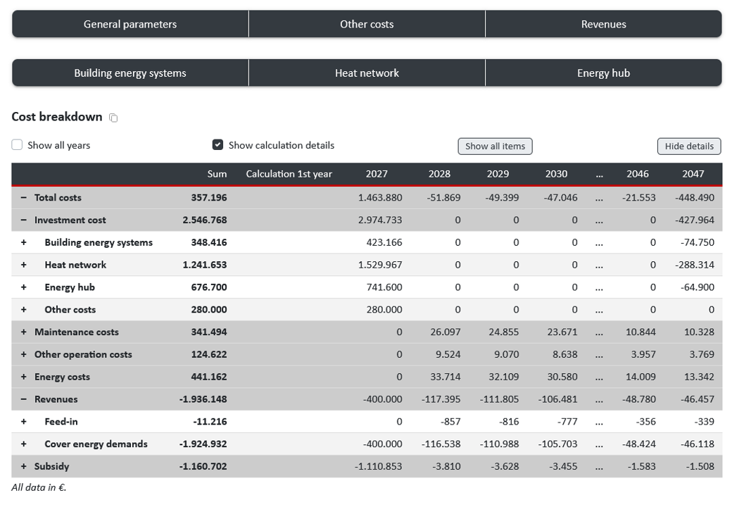
The cost breakdown, shown as an example in Figure 3, itemizes all positions: investment costs, maintenance costs and energy costs – in each case broken down to the individual plant – as well as the revenues from covering the demands. In district projects, the building energy systems and the heating network are added.
Three views can be activated:
- Show calculation details displays the calculation path of the first year, so that every total becomes traceable.
- Show all years extends the table by one column for each year of the period under consideration. The values are discounted to the start year and therefore decrease from year to year by the discount rate.
- Show all positions expands the complete hierarchy down to the individual plant.
In district projects, the network costs are stored by pipe diameter; pipe and installation costs can be adjusted separately. Default values for costs in the heating network and economic parameters for energy system technologies are documented on our pages.
Details
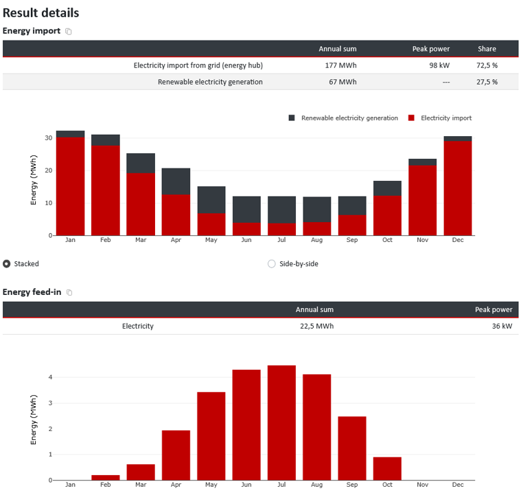
The details area contains the detailed energy evaluation, as shown for example in Figure 4. For each category, the annual total, the maximum capacity and the percentage share are reported, supplemented by a monthly diagram that can be displayed either stacked or side by side:
- Energy purchase: all purchase sources with their respective share of the total supply
- Energy feed-in: energy amounts fed in and their maximum capacity
- Electricity generation and purchase: breakdown by technology including the self-sufficiency rate
- Heat generation and purchase: coverage shares of the individual heat generators over the year
The monthly view makes the seasonal division of labor within the system immediately visible – for example that a waste heat source covers a considerable part of the load in winter, while purchases decline sharply overall in summer. The corresponding hourly values, annual load duration curves and heat maps are available in the energy center module.
Variant comparison
A project is rarely decided with a single calculation. The actual question is usually which of several supply concepts performs best – and that is exactly what the variant comparison answers.
Figure Figure 5 shows how you can use the “Variant comparison” button within the “Summary and variants” tab to select a variant for the comparison or, if no valid variant is available yet, to copy the current variant for subsequent editing. Any number of variants can also be added.
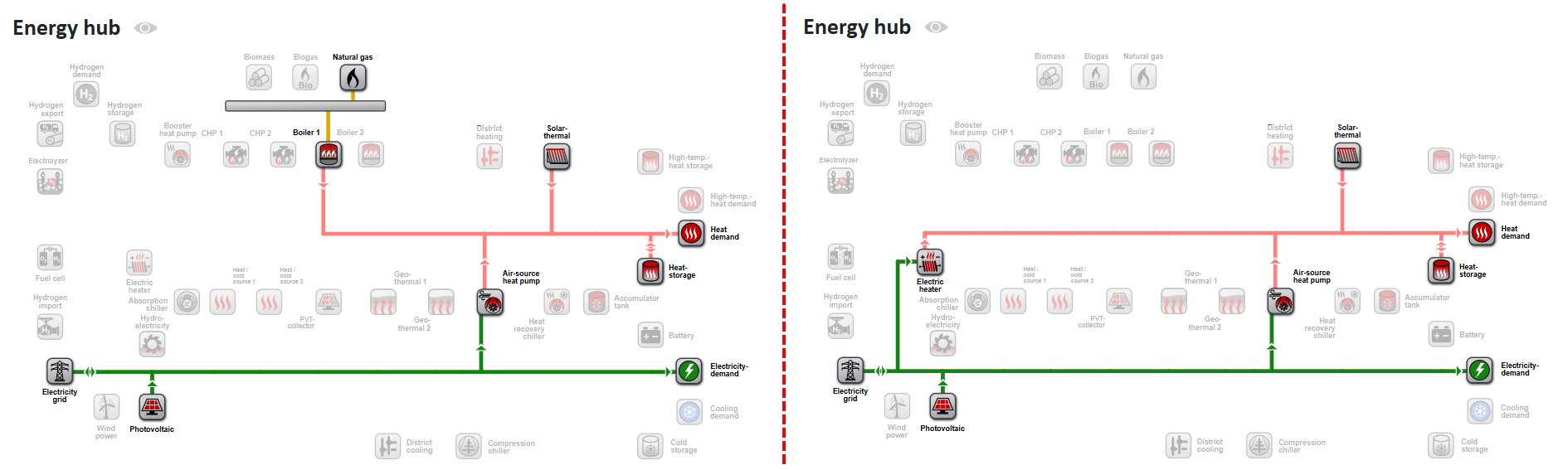
Here, two variants with different plants but otherwise identical configuration are created as an example (see Figure 6):
- Variant 1 – gas boiler + ASHP (heating network with a gas-fired boiler & air-source heat pump)
- Variant 2 – electric heating element + ASHP (heating network with an electric heating element & air-source heat pump)
Now, in one of the several variants, the district can be recalculated, the plants in the energy center dimensioned and the operation simulated. Afterwards, the path leads via the results to the variant comparison section.
Comparing the summary
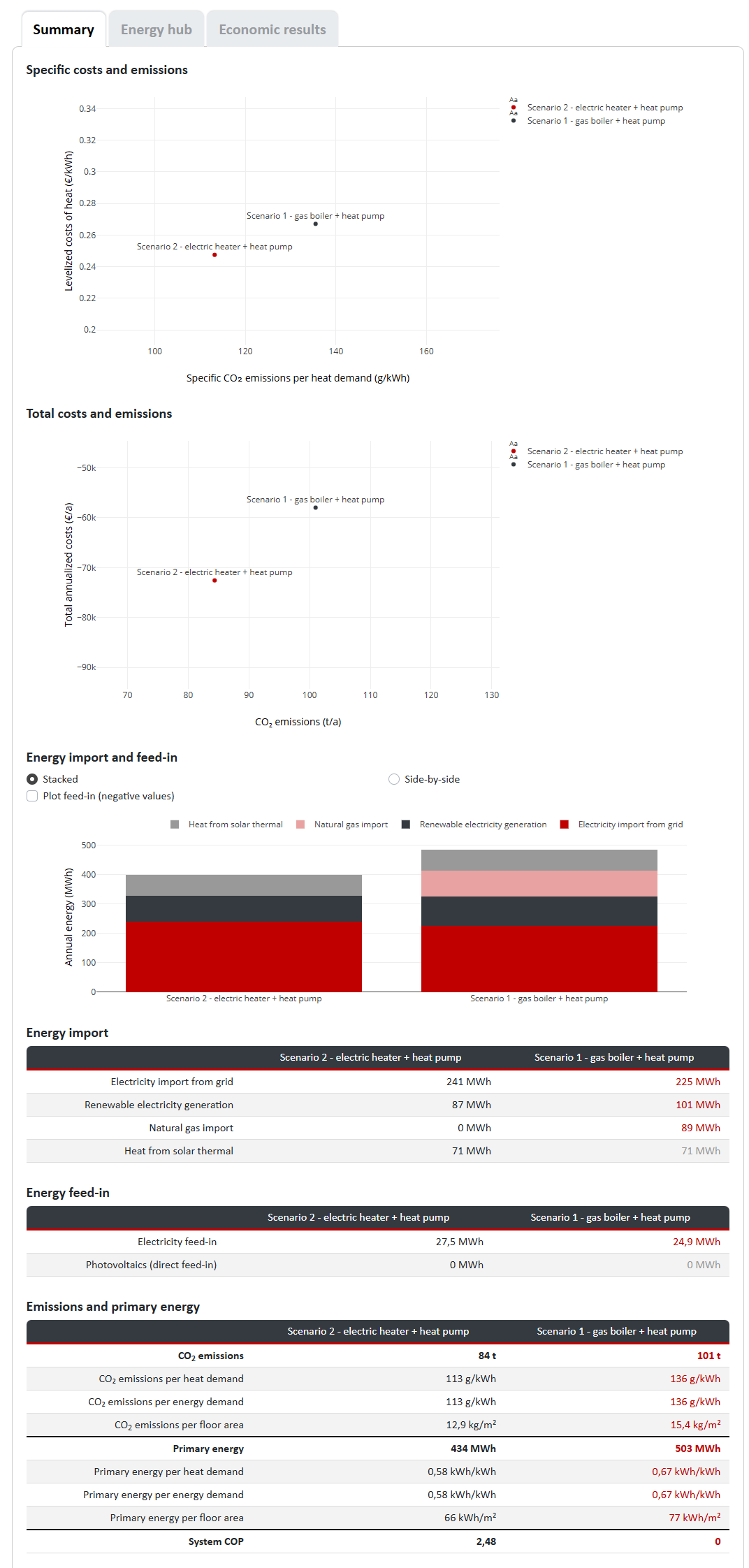
The summary places the variants side by side (see Figure 7). Values that are higher than those of the reference variant are highlighted in red, unchanged values are greyed out – this way the differences stand out without every line having to be read.
Comparing the energy center and economic feasibility
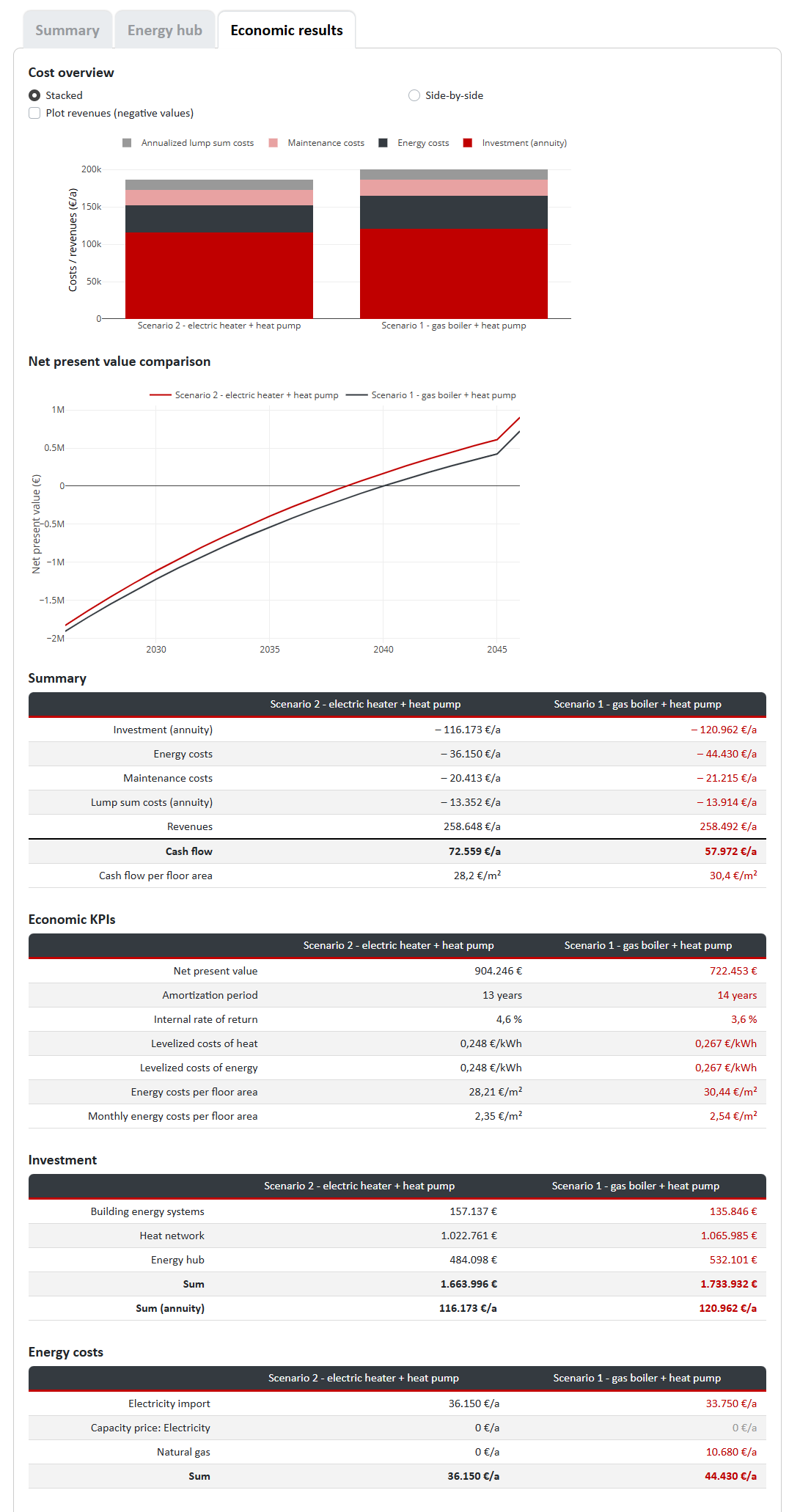
In the energy center and economic feasibility sections, differences and similarities between the variants become apparent in tables and charts, equivalent to the summary (see Figure 8). This is where the trade-offs become visible: a concept with higher investment costs may well pay off over the period under consideration through lower energy costs.
All results of the variant comparison can be downloaded together as an Excel file. With clear, detailed summaries of technical and economic parameters, nPro thus facilitates the assessment of projects.